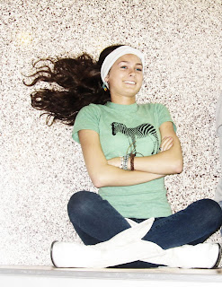
 In this photo I had Lauren sit against a wall and instead of taking a birds eye view I stood above her and took the picture of her looking up. Her legs are against the wall while she is laying on the ground. The editing was a gradient with low opacity for a dull look. It was hard to find new ways to take the picture and I didn't like the scenes as much as some of my other projects.
 Tuesday, May 17, 2011
Forced Perspective
In this photo I have Lauren laying on the ground with her feet up in the air reading a book. The 'forced perspective' makes it look like a birds eye view of her reading sitting up strait against a wall. I edited it with brightness and contrast and I gave it a redder tone with the red curves adjustment. Taking pictures and setting up the scene was the hardest part about this project. Especially working around the school with limited time also made it hard to make the picture unique.
 In this photo I had Lauren sit against a wall and instead of taking a birds eye view I stood above her and took the picture of her looking up. Her legs are against the wall while she is laying on the ground. The editing was a gradient with low opacity for a dull look. It was hard to find new ways to take the picture and I didn't like the scenes as much as some of my other projects.
 In this photo I had Lauren sit against a wall and instead of taking a birds eye view I stood above her and took the picture of her looking up. Her legs are against the wall while she is laying on the ground. The editing was a gradient with low opacity for a dull look. It was hard to find new ways to take the picture and I didn't like the scenes as much as some of my other projects.
 Monday, May 9, 2011
Color Fill Edits
For this photo I turned the shirt from aqua blue to purple. The second edit was changing the white shoe to orange. The shoe has complement colors blue and orange. The whole picture is analogous because of the red blanket, blue jeans, and purple shirt. The selection was easy to do and I like the editing tool for creating a good mix of colors.
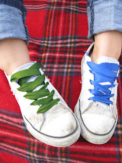 In this edit I have green, blue and red. The colors make up split complementary colors. The editing style I used was selection and color fill layers. I changed the opacity in both pictures of the selected area. I changed the left shoelace from blue to green for added color and appeal to the picture. The detail of the laces was hard to select using the magnetic tool but it was a great effect for my theme.
 In this edit I have green, blue and red. The colors make up split complementary colors. The editing style I used was selection and color fill layers. I changed the opacity in both pictures of the selected area. I changed the left shoelace from blue to green for added color and appeal to the picture. The detail of the laces was hard to select using the magnetic tool but it was a great effect for my theme.
 Monday, May 2, 2011
Thursday, April 28, 2011
Wednesday, April 20, 2011
High Contrast/ Vintage/ Pictorialism
The first edit is the high contrast. I edited it with the hue and saturation that were very high numbers. I made the variance high for more color. Lastly I used the curves to make the sky appear white. This was a simple edit that I have already been using on my photos this year.
 In the second edit, I made it look as if it had a vintage color to it. I first used the curves to focus on the red, blue and yellow curves for a more of a yellow tint with lighter blues. Next I added a photo filter with a sepia hue to it so the whites would be a tea bag stained color. This was a more complex edit but fairly simple by using the curves and photo filter.
 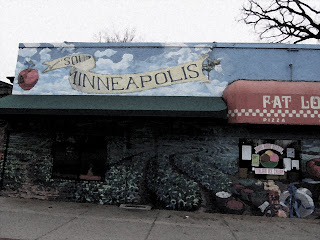 The last edit was using the pictorialism. For the picture I made the smart layer then I added a film grain to blur the image. Then I added a Gaussian blur for more watercolor affect. I played around with some of the filters and added a water color effect with to the picture and that made it easier to convey the look I wanted.
Tuesday, April 12, 2011
Theme Illistator
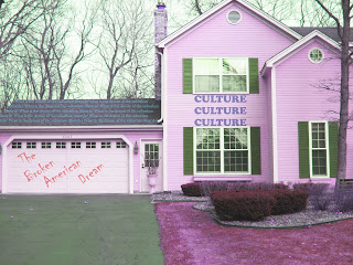 My theme is pop culture, for the editing process, I turned the original color of the house from yellow to a magenta color with the hue pallet. I also used the sharpen tool we learned in class recently at a very low amount. Then I went into illistator and added words surrounding the idea of "pop culture in the american dream" it's a broken down concept of the average american home being twisted by today's culture. On the roof of the garage it asks the question of "What is the dream of the suburban lifestyle?" It doesn't nessisarrily make sense, but its suppose to be corrupt. The illistator was a hard tool to use when fitting where I wanted the words to fit. But it was a great addition to the editing process.
 Monday, April 11, 2011
Friday, March 18, 2011
Rhythm
For this picture I used the selection tool to place the subject (Bridget) across the wall. When all the photos were moved I used the curves and brightness tool to brighten the picture. While using selection, I used the quick selection tool. I had troubles when selection though the small details like her hands and sweater outline. The other downfall was the last phot to the left was blurry because I had to enlarge it a little bit from the original photo. But by the third selection, it was easier for to select and move the subject. 

For the second picture I had a little more difficulty selecting the subject and moving her to the right spot on the couch. The previous photos were a little more detailed and not exactly what I wanted to capture in the photo. I had a litimited of photos that I wanted to use and that made it more difficult. I used the quick selection tool once again but then had to use the magnetic tool for two of the subjects. The editing process was also an issue because they weren't all the same brightness which made the photo look less natural.
Friday, March 11, 2011
Portraits and Lighting
The photo above was edited by adding a lens flare at the top left corner creating the illusion that sun was pouring in as morning natural lighting. I would call this photo a 3/4 lighting with natural light because only a part of her face is being illuminated coming from the back corner. I also used a little spot healing technique to clean up an impurity. A strength I had when taking these photos was that it was a comfortable setting and I was able to capture what I imagined the picture would be. The new editing tools were a great addition that I learned how to use. A weakness was finding the blanance between the original and editing it to look realistic.
For the photo of Lauren I used a slight surface blur and a photo filter with a warming effect. The photo filter was a little more difficult to work with because it was almost little difference at first but then I was able to change the opacity and it helped to create the warmer feeling to the picture. Some downfalls though were editing and croping and recroping until I knew I had the picture and the subject position I wanted.
In this photo I used artificial lighting and it was directly on her face. The subject (Lydia) was dressed up ready for a dance and I thought it would be the perfect time to capture her. I used surface blur to edit out her imperfection and blotchyness in her face. I went over the surface blur with a paintbrush tool to harden her eyes and mouth. The difficulty I had was the lighting because none of the lighting (3/4, back, etc.) wasn't capturing what I wanted. Also was erasing all of her imperfection to make her skin seem almost flawless.
Selection Tools
This photo was originally a leafy background with bright greens and stems coming from every angle. When I used the selection tool I inverted it so that the background would become darker and black and white. In doing so, the flower pops in the picture and creates for a more interesting picture. This was pretty simple of a subject to select with few intricate lines. The editing process was simple as well when I just darken the background then made it black and white.
In this photo, I used the lasso selection tool because it had more detailed lines that wouldn't be able to capture in using the magic wand or quick selection tools. Once again I inverted the selection and made the background black and white but kept the details bright. The subject (Lauren) was kept in color and already edited by brightning her face and surface blur. This was a little more difficult than the first picture because she had so many details around her hair and it was hard to keep the lasso tool steady with the mouse.
Thursday, February 17, 2011
White Blance and Vingettes
For the first image I used the auto white balance on the photo. When I was editing the picture I blanced out the contrast and brightness. I also added a brown vignette to the edges of the photo with 150 px feather. The strength of this photo was my goal of what I wanted to capture. I was able to capture the laughter and freedom I wanted. The simplicity of just her hair, and the white tshirt made the focal point stand out and really engage with the idea I wanted. Some weakness would I would have liked to have made this black and white but i don't think that I would have captured the same playfulness as I would have in color. What surprised me was how simple it was to think about the influence I wanted to pursue in the picture. I didn't think so much about how I was going to take the picture but instead I just started snapping pictures ignoring the "perfect picture" in my head.
In this photo I cropped it and I made it brighter. I wanted to focus on wood instead of the surrounding area. In this picture I also used the clone stamp to add an extra wicker ball. So the intent wasn't to focus on to bowl or few balls but kept the main focal point strong. My strengths were the editing process when I made it brighter and contrasted the background. But my weakness was the clone stamp process which I feel I still need practice on. the clarity of the photo was hard to grasp and especially in the center of the pile. I wouldn't change anything except maybe make the subject more exciting than a center piece.
Friday, February 11, 2011
A Day in the Life of My Shoes
In my two photos, I auto toned both. After the got the natural colors of the pictures I tinted the color manually. I used little contrast in both of the photos because the color wasn't needed to pop the whites and darken the black shades. Both pictures were croped so the focus of the picture would be shifted to the sides abiding by the Rule of Thirds.
If I could I would have make the bottom part of the Bed Side Table Frame picture darker and the wires would be hidden to keep focus on the main subject. In the Carpet picture, I think a strong point was the editing process for me. I had frustration when it came to editing some of the other pictures, croping was the strong point of editing. Making my pictures look realistic was hard because I couldn't spot the difference between my orginal photo and what needed to be edited.
Tuesday, February 8, 2011
Artist Statement
Art is the big picture of all things that are able to express who you are and what you stand for. It's a outlet for showing off one's personal achievements, hardships and creativity. Art, to me, is all around. Everything in the world inspires me to create a photo or an outfit as a way of expressing how I feel. Art means to me the feeling that someone is going through shown indirectly to the rest of the world. When I'm creating a photo or outfit I let myself run into what may inspire me, not look for it. Most of my inspiration comes from other people and their advancements, style, or downfalls. I look at people then morph their look into something I'm able to create with my own resources. So far the type of work I've created isn't showing through to my creativity as much as I would have hoped it too. I feel sometimes like I've held back from what I truely want to capture. Sometimes I even feel that I'm scared to take a picture or wear a certain outfit because of what people will think, it won't look unique, or how I will look in the outfit. It may look good in my head, but I put it together and it never turns out the way I want it too look, whether it's too simple, or too complex.
Annie Leibovitz is a photographer of the modern era who currently shoots celebrities mostly, and surpasses the normal portrait turning the body into art. Leibovitz uses techniques to do with lighting, she plays around with her subjects to appear plastic like and pure. She surrounds the subject with neutral colors that make the face or skin of the subject pop. They are sometimes fantasy like and take place in nature when she's not shooting celebrities. I think that she makes a strong statement when she's taking her photos. Especially when her infamous celebrity pictures that grace the pages of Vanity Fair they capture a controversy or hardship in their lives. It's simple and captures the the feeling of the subject. Click here to see Annie Leibovitz shot of Queen Elizabeth II shot in 2007.
Annie Leibovitz is a photographer of the modern era who currently shoots celebrities mostly, and surpasses the normal portrait turning the body into art. Leibovitz uses techniques to do with lighting, she plays around with her subjects to appear plastic like and pure. She surrounds the subject with neutral colors that make the face or skin of the subject pop. They are sometimes fantasy like and take place in nature when she's not shooting celebrities. I think that she makes a strong statement when she's taking her photos. Especially when her infamous celebrity pictures that grace the pages of Vanity Fair they capture a controversy or hardship in their lives. It's simple and captures the the feeling of the subject. Click here to see Annie Leibovitz shot of Queen Elizabeth II shot in 2007.
Subscribe to:
Comments (Atom)


