Tuesday, May 17, 2011

Forced Perspective

In this photo I have Lauren laying on the ground with her feet up in the air reading a book. The 'forced perspective' makes it look like a birds eye view of her reading sitting up strait against a wall. I edited it with brightness and contrast and I gave it a redder tone with the red curves adjustment. Taking pictures and setting up the scene was the hardest part about this project. Especially working around the school with limited time also made it hard to make the picture unique.
In this photo I had Lauren sit against a wall and instead of taking a birds eye view I stood above her and took the picture of her looking up. Her legs are against the wall while she is laying on the ground. The editing was a gradient with low opacity for a dull look. It was hard to find new ways to take the picture and I didn't like the scenes as much as some of my other projects.

Monday, May 9, 2011

Color Fill Edits

For this photo I turned the shirt from aqua blue to purple. The second edit was changing the white shoe to orange. The shoe has complement colors blue and orange. The whole picture is analogous because of the red blanket, blue jeans, and purple shirt. The selection was easy to do and I like the editing tool for creating a good mix of colors.
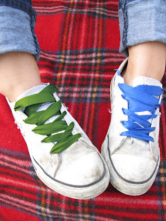
In this edit I have green, blue and red. The colors make up split complementary colors. The editing style I used was selection and color fill layers. I changed the opacity in both pictures of the selected area. I changed the left shoelace from blue to green for added color and appeal to the picture. The detail of the laces was hard to select using the magnetic tool but it was a great effect for my theme.   

Thursday, April 28, 2011

Solarisation & Sabatier

 Positive Solarisation
Negative Solarisation

Negative solarisation with curve adjustment.

Custom curve adjusment with red adjustment.

Wednesday, April 20, 2011

High Contrast/ Vintage/ Pictorialism

The first edit is the high contrast. I edited it with the hue and saturation that were very high numbers. I made the variance high for more color. Lastly I used the curves to make the sky appear white. This was a simple edit that I have already been using on my photos this year.
In the second edit, I made it look as if it had a vintage color to it. I first used the curves to focus on the red, blue and yellow curves for a more of a yellow tint with lighter blues. Next I added a photo filter with a sepia hue to it so the whites would be a tea bag stained color. This was a more complex edit but fairly simple by using the curves and photo filter.
The last edit was using the pictorialism. For the picture I made the smart layer then I added a film grain to blur the image. Then I added a Gaussian blur for more watercolor affect. I played around with some of the filters and added a water color effect with to the picture and that made it easier to convey the look I wanted.

Tuesday, April 12, 2011

Theme Illistator

My theme is pop culture, for the editing process, I turned the original color of the house from yellow to a magenta color with the hue pallet. I also used the sharpen tool we learned in class recently at a very low amount. Then I went into illistator and added words surrounding the idea of "pop culture in the american dream" it's a broken down concept of the average american home being twisted by today's culture. On the roof of the garage it asks the question of "What is the dream of the suburban lifestyle?" It doesn't nessisarrily make sense, but its suppose to be corrupt. The illistator was a hard tool to use when fitting where I wanted the words to fit. But it was a great addition to the editing process.